CanopyClick Landing Page
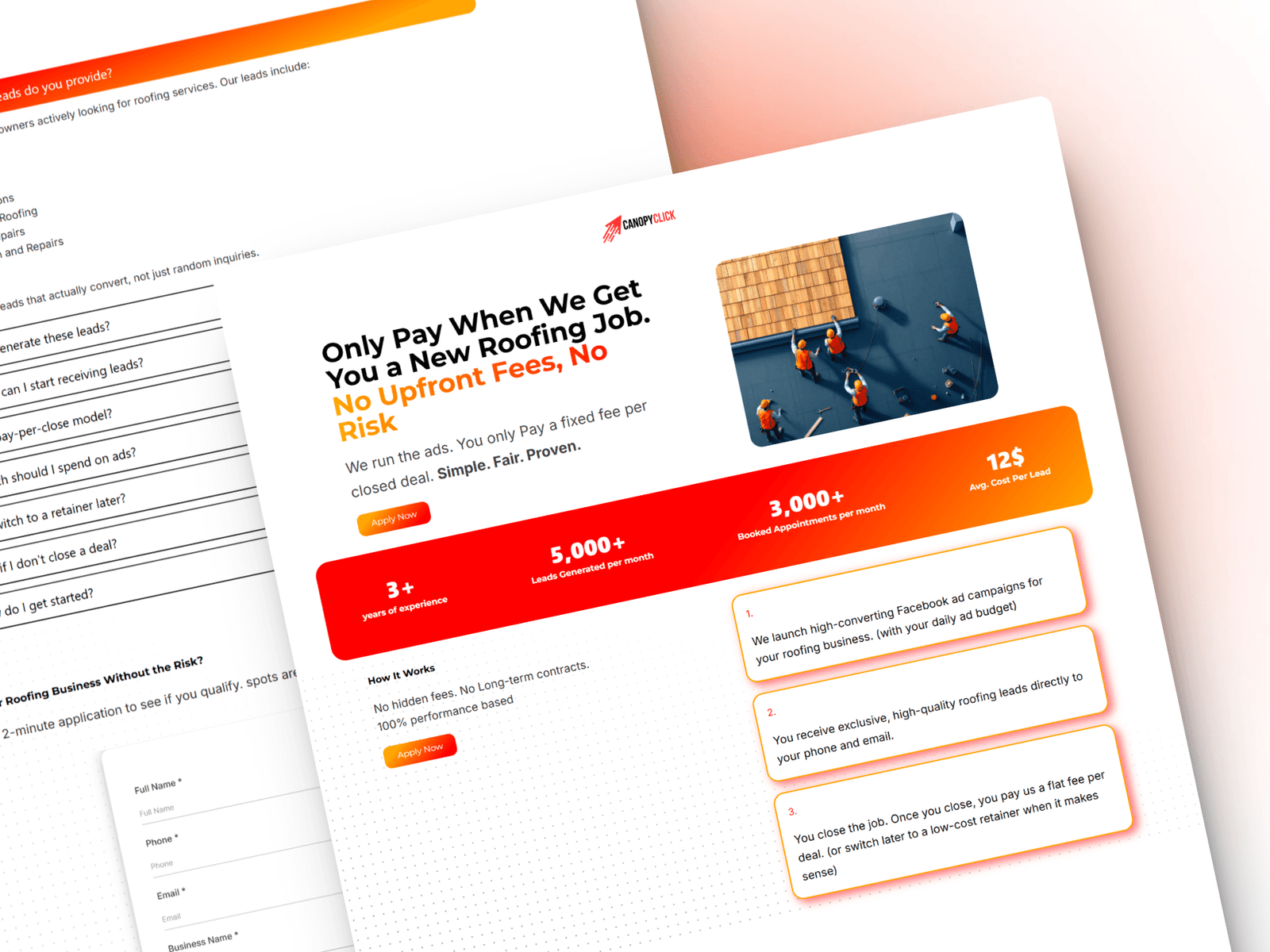
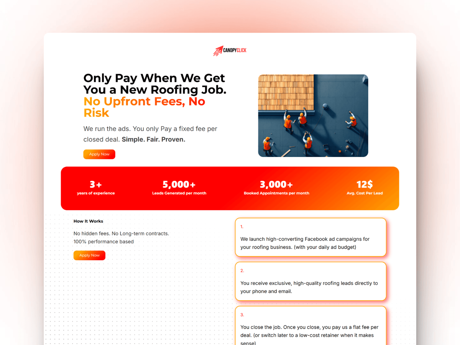
When CanopyClick came to me, they were frustrated with their old landing page, it wasn’t converting at all. The design felt outdated, the copy didn’t speak to roofers, and there was no clear direction for visitors to take action. It was cluttered, confusing, and just didn’t build trust.
So, I redesigned it from the ground up. Clean, simple visuals that looked professional but not overwhelming. Strong copy that actually speaks to their ideal client. Clear, obvious calls to action.
We launched the new page with their ads, and literally the same day, they started getting client bookings.
TMSDC Education Foundation
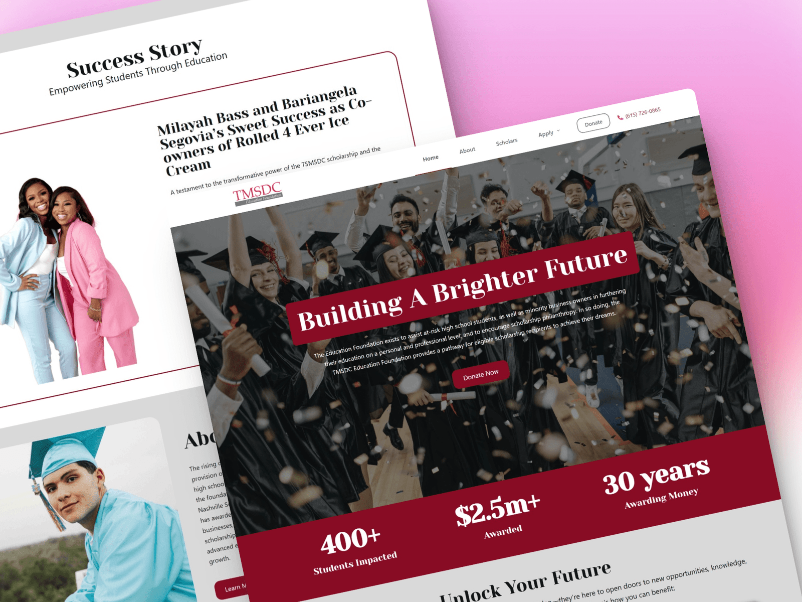
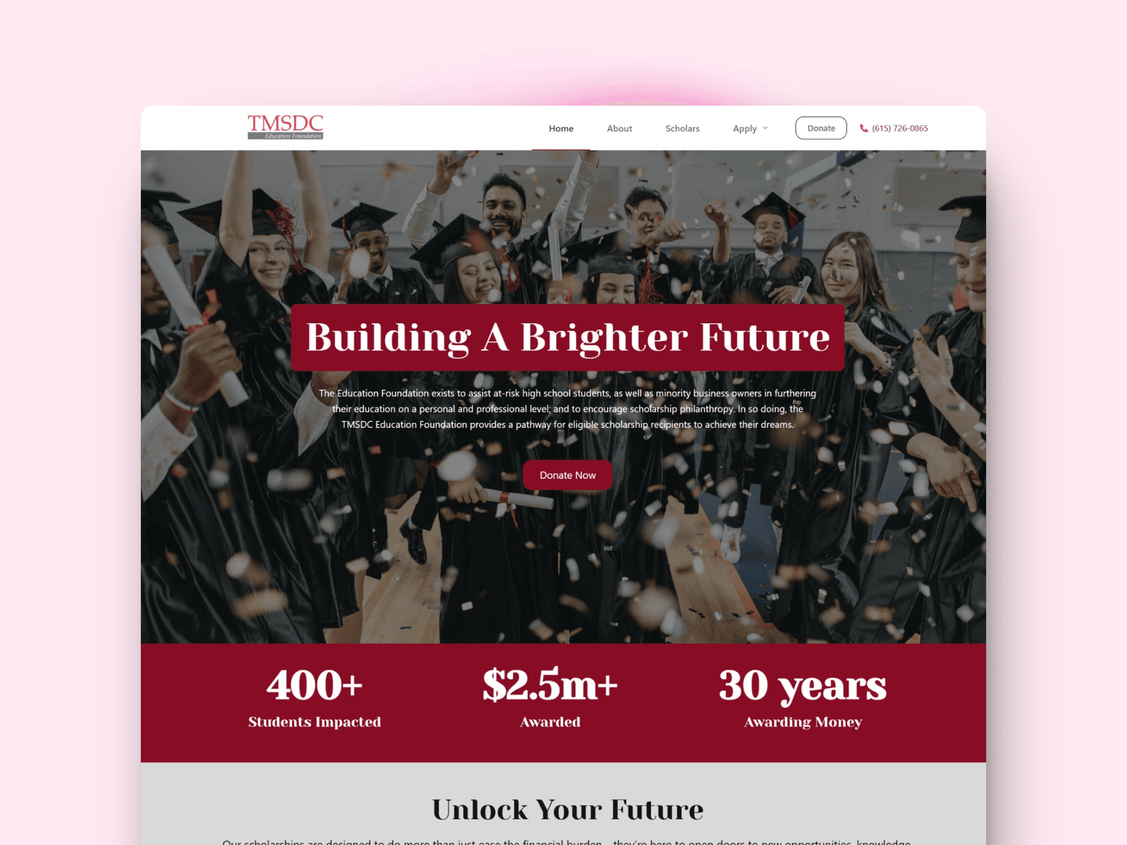
When the TMSDC Education Foundation reached out, their website didn’t reflect the heart of their mission. It looked outdated, hard to navigate, and didn’t clearly show the impact they were making in the community. It lacked warmth, clarity, and a sense of purpose.
I helped them redesign the site to feel modern, trustworthy, and aligned with their goals. Clear messaging, clean structure, and visuals that highlight their story. Now, donors, students, and partners can understand what they do in seconds and take action with confidence.
This wasn’t just a new design, it was a digital home that finally matched their vision.
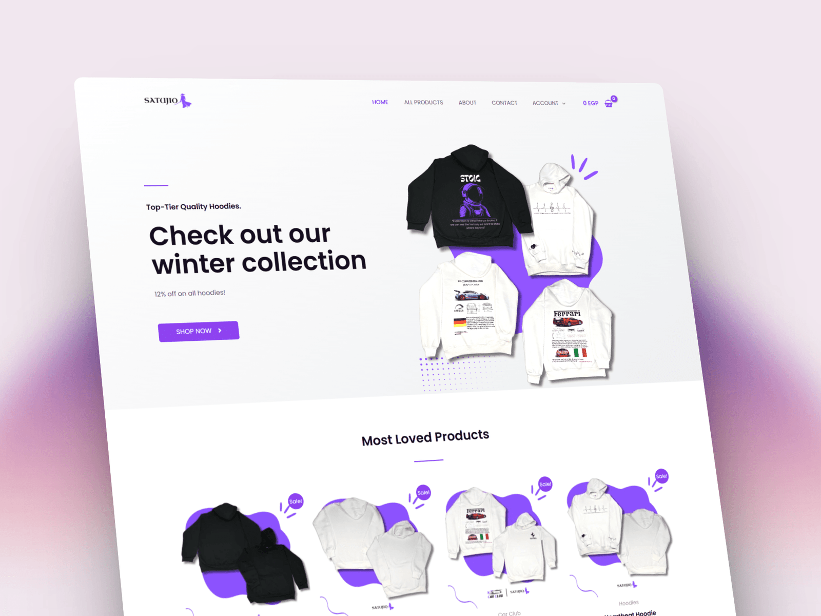
Satujio Online Store
Satujio started as a simple idea: a clean online store selling bold, print-on-demand hoodies. When I came on board, they had the product, but needed a storefront that felt as fresh as their designs.
I built a minimal, modern eCommerce site that puts the hoodies front and center. Easy navigation, strong product visuals, and a smooth shopping flow. No clutter, no confusion. Whether you’re browsing on desktop or mobile, the experience feels effortless.
The result? A site that looks good, works fast, and helps customers actually check out, not bounce.
